

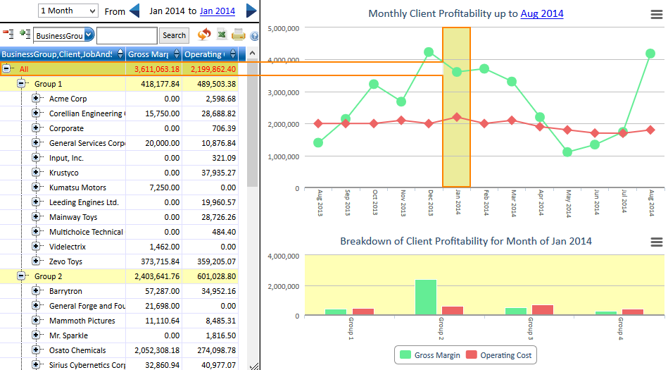
Analysis Dashboards show data using history and sub-category graphs while simultaneously displaying the figures for the graphs in a data table on the left. The data table is presented as a tree where the branches are sub-categories. A typical category hierarchy would be Business Group > Client > Job. The graphs and table are interactive, allowing drill-down to sub-categories, or selection of historical periods.
You will notice that initially the data for the current period will be highlighted in dark yellow on the history graph displayed on the top right, and a light yellow on the category graph displayed on the bottom right. The corresponding figures in the data table on the left are highlighted with the same colours as the graphs.
The following image gives an example of the Client Profitability analysis dashboard. The figures for the data table line 'All' will match those on the selected period of Jan 2014 on the history graph. The figures for 'Group 1' will match the bars for 'Group 1' on the category graph.

The data on the dashboard can be filtered according to a specific period or date through the period/date selector located at the top of the dashboard. There are 3 parts to the selector:
Note: The 'period type' default is set at one month
Note: Only dashboard that are grouped by job will allow viewing the Job Time and Cost Summary.